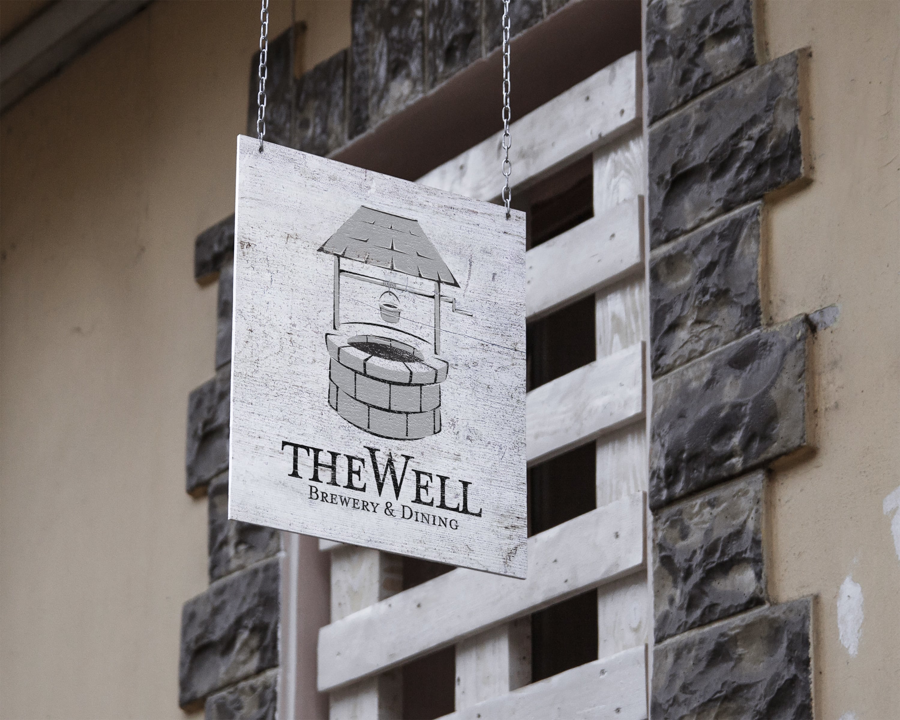
This logo was created for a group of investors who were in the process of purchasing and re-branding an existing and historically significant restaurant in the mid-west. The concept behind this logo was to create a symmetrically balanced design that represents sustenance and prosperity while paying homage to old style English pub signage. To assist with capturing the essence of that look, along with the balance, I chose the Mrs Eaves typeface, which has an antique typewritten design intended to help re-establish the new restaurant as a historical gathering place that celebrates great food and local culture.