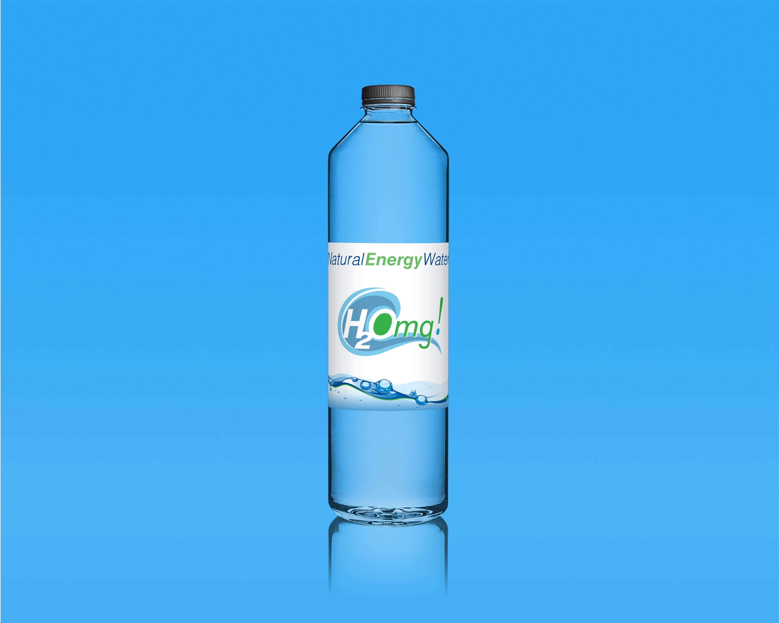
The H2Omg! Energy Water logo was the result of an in depth marketing campaign that began when I received a detailed design brief from my client that specified the need of to create a promotion focusing on their newest concept product: all natural energy water. The target demographic for this campaign was teen to twenty something female consumers who were looking for something more than just hydration and health conscious enough to avoid high sugar and high caffeine drinks that can lead to undesirable side effects. The typeface that I chose for this project is Helvetica with a slight italic that I added to express momentum and forward moving energy, while the colors reflect a clean and natural product. The graphic element represents a cresting wave with the “O” of the text as the overall focal point.