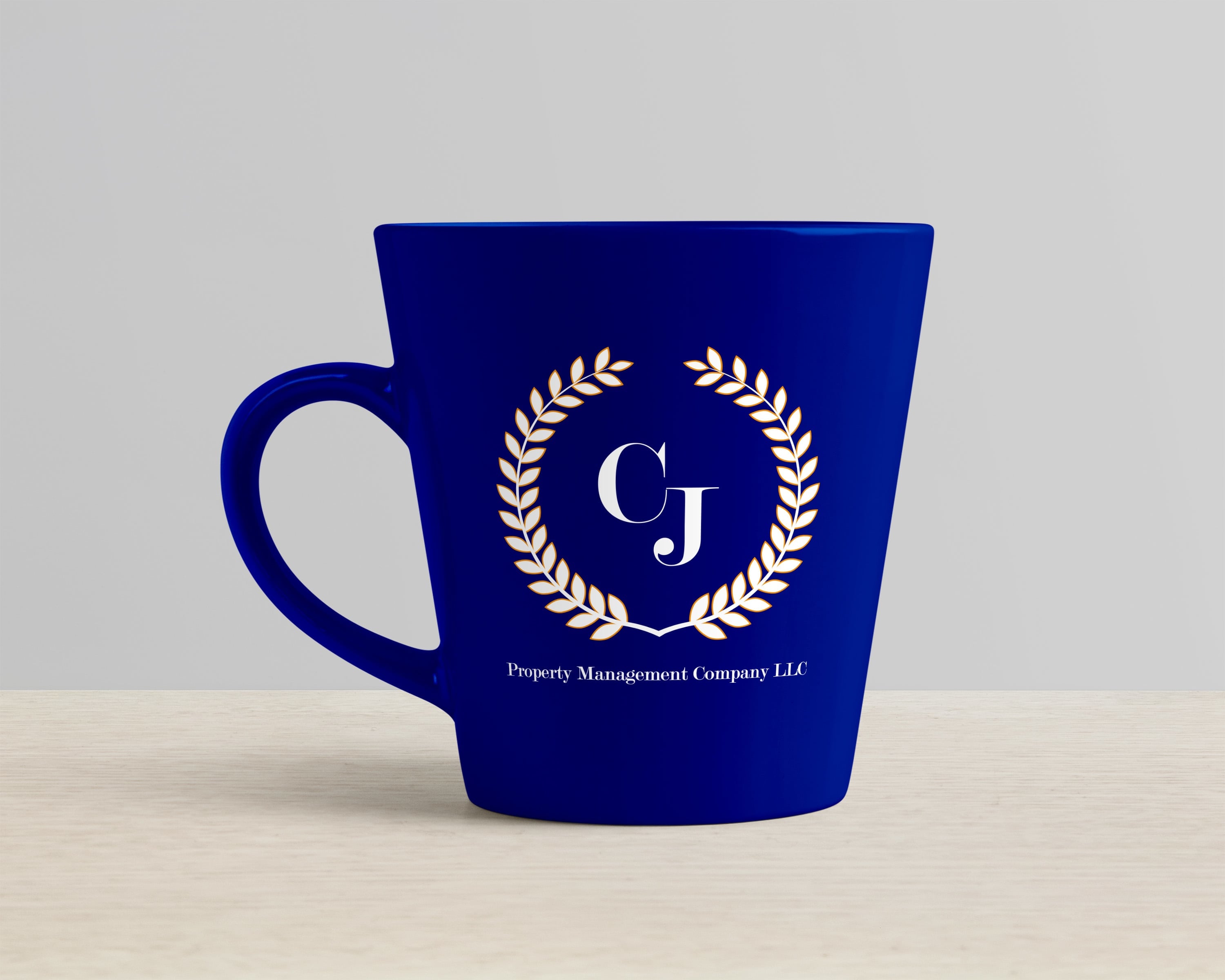
I began rebranding CJ Property Management after being contacted for a meeting request to discuss marketing ideas with the owner. Jon and I sat down and discussed all aspects of successful branding and marketing as he told me his business goals and how I could help him reach them. The first item on the list was to create a clean and recognizable logo for the business. This logo and color set would be utilized for all of the branding needs of the company to include: stationary, advertising, apparel, etc. The client specified that he would like to incorporate a laurel as one of the graphic elements of the logo which gave the project a theme. After creating the laurel, and outlining it in yellow-orange, I decided to use the complimentary color of blue-violet for the other prominent color while using the typeface Modern 20 for the Roman style font displayed.