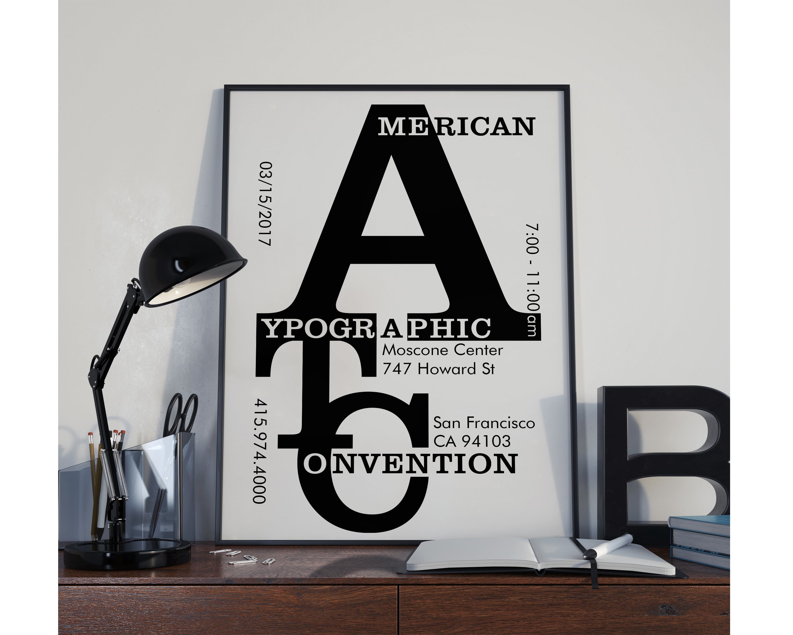
I created this poster to advertise and promote the American Typographic Convention in San Francisco. The concept behind the design was to showcase both classic and modern type styles by displaying the text as the only graphic element on the page and shown in its original context, black on white. The typeface I used for the prominent slab-serif copy is Clarendon, which represents typeface antiquity with its design and introduction taking place in 1845. To contrast the girth and heaviness of that typeface I chose Futura for the sans serif copy that provides details for the event and provides a more modern look, regardless of it’s 1925 debut.